In 2017, brand identity was at the heart of launching Milkman, a new dairy brand designed to stand out in a crowded FMCG market. Our brief was to create a brand from the ground up that felt fresh, modern, and proudly local. We explored three potential names, and Milkman emerged as the clear favourite due to its simplicity, memorability, and everyday authenticity. This foundation shaped the brand’s tone, look, and market positioning.
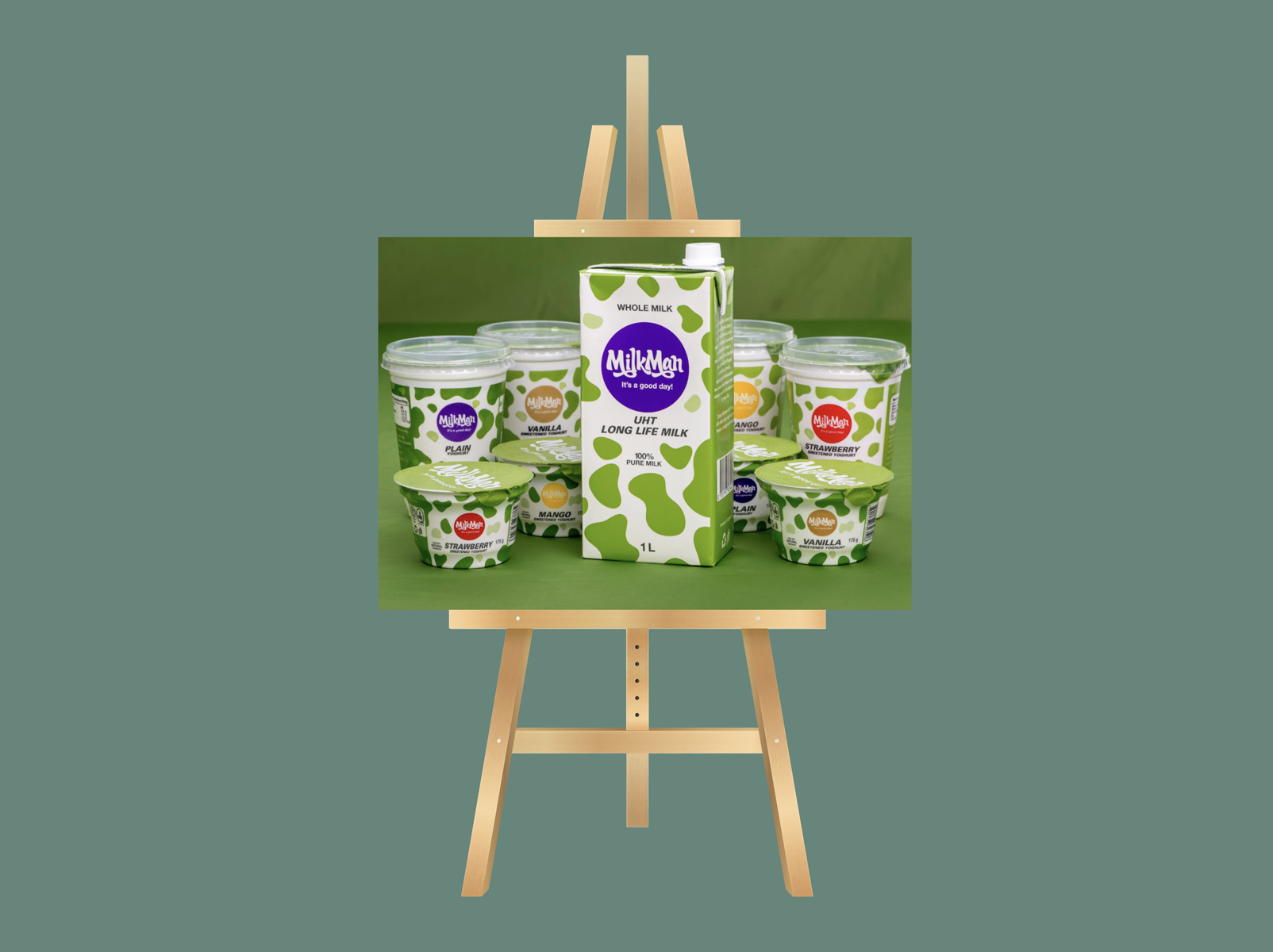
We developed five logo options and four packaging directions. Each was tested and refined through consumer focus groups to ensure the design matched real preferences and expectations. The winning concept, a bold green cow pattern, became Milkman’s signature visual asset and a symbol of freshness and quality. From there, we built a complete brand identity system, a positioning strategy, and a website that introduced Milkman to the market as a confident local brand customers could trust.